Typography Is the Interface People Read
Use type size, spacing, line length, hierarchy, and font loading to make interfaces clearer and more comfortable.
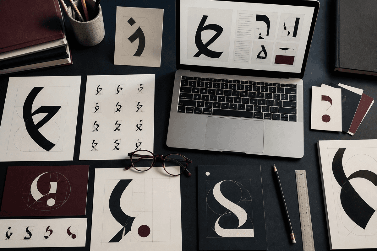
Most interfaces are made of words: navigation, labels, prices, instructions, errors, and content. Typography is therefore not a finishing detail. It is a major part of how the product works.
Create hierarchy through more than size. Weight, spacing, color, and position help distinguish a page title from a section heading or supporting label. Too many competing styles make the hierarchy harder to learn, while a restrained scale creates rhythm across screens.
Comfortable body text needs an appropriate line length and line height. Lines that stretch across a wide monitor are tiring to follow; lines that are too short interrupt reading constantly. Let content width respond to its purpose rather than filling every available pixel.
Test the actual language used by the product. A type system built around short placeholder labels may fail with real names, prices, or translated text. Check wrapping in buttons, cards, tables, and navigation before treating components as complete.
Finally, load fonts responsibly. Every family and weight has a performance cost. A well-chosen system font can be more effective than a distinctive font that delays the page or renders poorly. Good typography often feels quiet: readers notice the meaning first because the interface does not make reading harder than it needs to be.